15 Font Pairings Using Free Fonts in Squarespace and Canva for Your DIY Branding
With the 10 bajillion free and paid fonts available to use for your Squarespace site, it’s easy to feel overwhelmed when you attempt to DIY your branding.
As a web designer who has designed custom Squarespace websites for every niche under the sun—therapists, wellness coaches, contractors, and lawyers, just to name a few—I found that I needed to have font pairings I could refer to as I helped guide my clients to create a cohesive brand for their small business.
Fonts are a critical part of your brand's visual identity, conveying tone, personality, and professionalism. They are one of the first aspects of a website a user notices and instantly tells the reader what your business is all about.
And while I love virtually every font that graphic designers like Jen Wagner and Taylor Penton create, you could be spending upwards of $3000 for a unique font. I don’t know about you, but that feels like way too big of a commitment to make.
Thankfully, tools like Squarespace and Canva provide a wealth of free fonts that can elevate your designs without breaking the bank.
In this post, we'll explore 15 font pairings using free fonts available in both Squarespace and Canva. I’ll also walk you through the basics of font pairing, share best practices, highlight common mistakes to avoid, and guide you through the process of applying these pairings to your own branding.
Understanding Font Pairing
What is a Font Pairing?
Font pairing is the art of selecting two or more fonts that work well together. The goal is to create a harmonious and visually appealing design that enhances readability and conveys the intended message.
Why is Font Pairing Important for Branding and Marketing?
Effective font pairing is crucial because fonts play a significant role in how your brand is perceived. The right combinations can:
Enhance readability and user experience
Super important for your SEO and accessibility If someone can’t read the words on your site, they’ll quickly leave and find the information they are looking for on another, easier to read website.
*** For a complete guide on how to make sure your website and DIY branding are accessible and compliant with Google’s standards, check out my recent blog post, “The Importance of Website Accessibility in 2024”.
Establish a clear hierarchy and structure in your content
We tend to skim the text on a website so having your headings and subheadings contrast with your body text is important so website visitors can quickly find what they are looking for on your site.
Convey your brand's personality and tone
You can turn a basic Squarespace website template into a modern luxury brand by simply swapping out a sans-serif font for something with more movement like a script font.
Make your designs look professional and polished
When two fonts don’t work well together, it makes your website look sloppy and DIY. Just because you DIY your website, doesn’t mean it should look like a 4th grader did it!
Key Principles of Effective Font Pairing
Contrast
Pairing fonts with contrasting styles can create visual interest and help different elements stand out.
Complementarity
Fonts should complement each other stylistically, creating a cohesive look.
Hierarchy
Establishing a clear hierarchy ensures that your audience knows where to focus their attention.
Readability
Both fonts should be easy to read, especially for body text.
Choosing Fonts in Squarespace and Canva
How to Find and Use Free Fonts in Squarespace
Squarespace offers a wide selection of free fonts through its integration with Google Fonts. To choose fonts in Squarespace:
Navigate to the Design panel and select "Site Styles."
Click on the font you want to change, and a list of available fonts will appear.
Browse through the options, previewing how each font looks on your site.
Select the font you want to use, and adjust the size, weight, and spacing as needed.
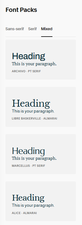
Squarespace also recently made it easier to visualize how the font combo will look on your site by creating “Font Packs” so you don’t have to try and come up with a winning pairing on your own.
But word to the wise: most beginner Squarespace users will select from these fonts so your website runs the risk of looking like someone else’s. Choose to be different!
How to Find and Use Free Fonts in Canva
Canva also provides a vast library of free fonts. To select fonts in Canva:
Open your design in Canva.
Click on the text element you want to edit.
In the top toolbar, click on the font dropdown menu to see the available fonts.
Browse and select the font you want to use. You can also adjust the size, weight, and other settings.
Font Pairing Best Practices
Use Contrast to Create Visual Interest
Contrasting fonts, such as pairing a bold headline font with a lighter body font, can create a dynamic and engaging design. Contrast helps important elements stand out and guides the reader's eye through the content.
Maintain Readability and Legibility
Ensure that your chosen fonts are easy to read, especially for body text. Avoid overly decorative fonts for large blocks of text and prioritize clarity.
Establish a Clear Hierarchy
Use different font sizes, weights, and styles to create a visual hierarchy. Headlines, subheadings, and body text should have distinct styles that guide the reader's attention through the content.
Ensure the Fonts Complement Each Other Stylistically
Choose fonts that share similar design elements, such as stroke width or x-height, to create a cohesive look. Fonts should feel like they belong together, even if they are different styles.
Limit the Number of Different Fonts Used
To maintain a clean and professional design, limit the number of different fonts you use. Two to three fonts are usually sufficient for most designs.
Font Pairing Mistakes to Avoid
Using Fonts That Are Too Similar
Pairing fonts that are too similar can make your design look unintentional and confusing. Ensure there is enough contrast between the fonts to create a clear distinction.
Overloading Your Design with Too Many Fonts
Using too many different fonts can make your design look chaotic and unprofessional. Stick to a limited number of fonts to maintain consistency and focus. Two main fonts and one to use sparingly as an accent is a good rule of thumb.
Ignoring the Brand Personality and Message
Choose fonts that reflect your brand's personality and message. A fun, playful brand that provides therapy services to children might use different fonts than a serious, professional one that provides business coaching for C-suite executives.
Neglecting Readability, Especially for Body Text
Prioritize readability, especially for body text. Avoid overly decorative fonts for long paragraphs and ensure your text is easy to read on all devices.
Failing to Test Font Pairings Across Different Devices and Platforms
Fonts can look different on various devices and screen sizes. Test your font pairings on multiple devices to ensure consistency and readability.
Font Pairing Examples to Use on Your Squarespace Website
Example 1: Montserrat + Open Sans
Description: Montserrat is a modern, geometric sans-serif font, while Open Sans is a clean and versatile sans-serif.
Why it works: Montserrat's bold and distinct style pairs well with the simplicity of Open Sans, creating a balanced and readable combination.
Best use cases: Websites, blogs, social media graphics.
Example 2: Playfair Display + Roboto
Description: Playfair Display is an elegant serif font, while Roboto is a modern sans-serif.
Why it works: The contrast between Playfair Display's classic look and Roboto's modern feel creates a sophisticated and readable design.
Best use cases: Professional websites, portfolios, marketing materials.
Example 3: Lora + Poppins
Description: Lora is a well-balanced serif font, and Poppins is a geometric sans-serif.
Why it works: Lora's readability and Poppins' modern style complement each other, making them ideal for various design projects.
Best use cases: Blogs, websites, print materials.
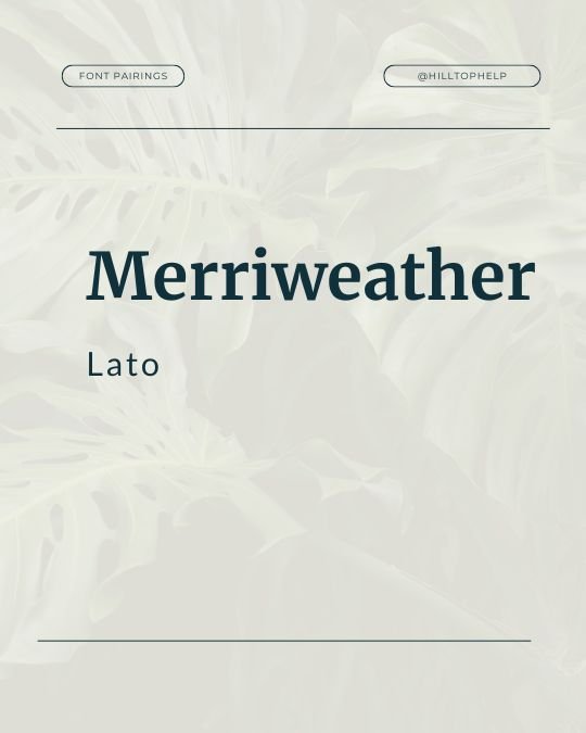
Example 4: Merriweather + Lato
Description: Merriweather is a highly readable serif font, while Lato is a versatile sans-serif.
Why it works: The combination of Merriweather's classic look and Lato's modern feel provides a balanced and professional appearance.
Best use cases: Corporate websites, business cards, presentations.
Example 5: Oswald + Raleway
Description: Oswald is a bold, condensed sans-serif, and Raleway is an elegant sans-serif.
Why it works: Oswald's strong presence and Raleway's sleek style create a dynamic and engaging combination.
Best use cases: Headlines, social media graphics, posters.
Example 6: Nunito + PT Serif
Description: Nunito is a rounded sans-serif, while PT Serif is a traditional serif font.
Why it works: The contrast between Nunito's friendly style and PT Serif's classic look makes for a readable and approachable design.
Best use cases: Blogs, educational websites, flyers.
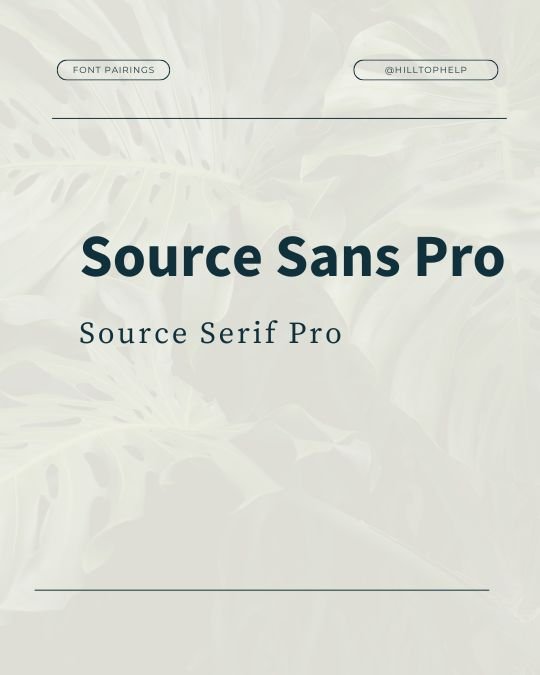
Example 7: Source Sans Pro + Source Serif Pro
Description: Both fonts are part of the Source family, with Source Sans Pro being a sans-serif and Source Serif Pro being a serif.
Why it works: The consistency within the font family ensures a cohesive and harmonious design.
Best use cases: Corporate websites, newsletters, reports.
Example 8: Rokkitt + Josefin Sans
Description: Rokkitt is a slab serif font, while Josefin Sans is a geometric sans-serif.
Why it works: The combination of Rokkitt's strong, structured look and Josefin Sans' elegant style creates a unique and balanced pairing.
Best use cases: Magazines, brochures, online articles.
Example 9: Karla + Georgia
Description: Karla is a grotesque sans-serif, and Georgia is a classic serif font.
Why it works: The contrast between Karla's modern style and Georgia's traditional look creates a readable and professional design.
Best use cases: Websites, blogs, marketing materials.
Example 10: Quicksand + Libre Baskerville
Description: Quicksand is a rounded sans-serif, and Libre Baskerville is a serif font designed for web use.
Why it works: The friendly and approachable look of Quicksand pairs well with the classic and readable Libre Baskerville.
Best use cases: Websites, social media graphics, print materials.
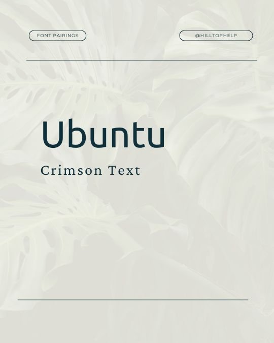
Example 11: Ubuntu + Crimson Text
Description: Ubuntu is a humanist sans-serif, while Crimson Text is an old-style serif font.
Why it works: The combination of Ubuntu's modern, clean lines and Crimson Text's classic elegance creates a balanced and engaging design.
Best use cases: Websites, blogs, digital publications.
Example 12: Bebas Neue + Open Sans
Description: Bebas Neue is a bold, all-caps sans-serif, and Open Sans is a versatile sans-serif.
Why it works: The boldness of Bebas Neue makes a strong impact, while Open Sans keeps the design readable and clean.
Best use cases: Headlines, social media graphics, posters.
Example 13: Fira Sans + Merriweather
Description: Fira Sans is a versatile sans-serif, and Merriweather is a highly readable serif font.
Why it works: The modern style of Fira Sans pairs well with the classic look of Merriweather, creating a professional and approachable design.
Best use cases: Corporate websites, blogs, presentations.
Example 14: Arvo + Montserrat
Description: Arvo is a geometric slab serif, while Montserrat is a modern sans-serif.
Why it works: The contrast between Arvo's structured look and Montserrat's sleek style makes for a dynamic and engaging design.
Best use cases: Websites, business cards, flyers.
Example 15: Work Sans + Playfair Display
Description: Work Sans is a humanist sans-serif, and Playfair Display is an elegant serif font.
Why it works: The combination of Work Sans' clean lines and Playfair Display's sophisticated style creates a balanced and visually appealing pairing.
Best use cases: Blogs, websites, social media graphics.
Additional Tips for DIY Branding
How to Maintain Consistency Across Different Platforms
Use the same font pairings across all your branding materials, including your website, social media graphics, and print materials.
Create a style guide that outlines your font choices, sizes, and usage guidelines.
Tips for Combining Font Pairings with Other Branding Elements
Consider how your fonts interact with other elements, such as colors, images, and logos.
Ensure that your font choices align with your overall brand aesthetic and message.
Conclusion
Font pairing is a crucial aspect of DIY branding and marketing. By carefully selecting and combining fonts, you can create a professional, cohesive, and visually appealing brand identity. The 15 font pairings we've explored in this post are just the beginning—experiment with different combinations, follow best practices, and avoid common mistakes to find the perfect fonts for your brand.
For more guidance on everything you need to launch your website, be sure to check out my recent blog post Website Design Checklist: Everything You Need to Launch Your Business Website/
TLDR: Here are some FAQs about selecting the right font pairing for your website.
-
Consider your brand's personality, target audience, and the message you want to convey. Choose fonts that align with these elements and enhance your overall brand identity.
-
Prioritize readability and legibility, especially for body text. Test your font choices on different devices and screen sizes to ensure they are accessible to all users.
-
Yes, these font pairings can be used for both digital and print materials. Just be sure to test your designs in print to ensure the fonts look as expected.
-
Some common pitfalls include using too many different fonts, neglecting readability, and failing to maintain consistency across different platforms. Stick to a limited number of fonts, prioritize clarity, and ensure your designs align with your overall brand identity.
Resources
Canva's Font Library
Contact me for personalized brand, web design, or SEO consultations or services.
Pin this for Later:
Browse the Blog:

